
This site is over a decade old, which in WordPress is a long time – it’s been a long time to work in WordPress and a long time in software evolution. The theme I’ve used up until today is frankly a dinosaur – it’s called Simply Read, I was one of only 112 sites using it, and you can’t even download it anymore. It’s not Gutenberg compatible, and it knows NOTHING of full site editing (FSE). So today, I updated it. This site now runs on Ollie, as thousands of others do.
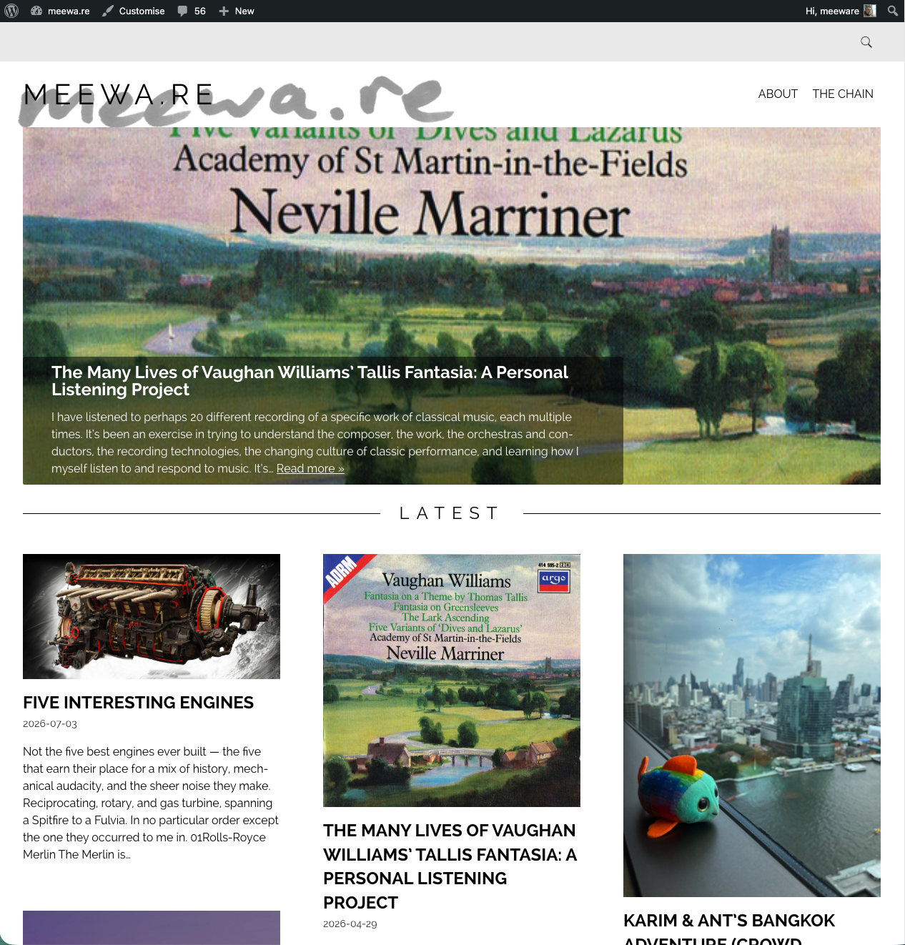
the way we were…
Ollie is a very popular theme, in fact we often just treat it as a default starter theme for projects at Human Made. It’s considered to be relatively unopinionated, has good logical structure, and is well maintained. And the initial process of introducing the theme worked very smoothly. I set up a little backlog of tasks, highlighting a desire to get the aesthetic appearance more or less like the last version, and making sure I was well set up for some future projects (it’s a geek hobby thing, more later). But then I hit what I am going to call a bug.
A Problem of Inheritance
Tweaking around the index page, the main landing page for the site, I was working with the “Index” template in the theme editor. All looked great – crisp thumbnails good layout, but for the life of me I couldn’t work out how to change the background colour. I’m relatively new to FSE, but I assumed I’m in the index template, or in the styles, and I should be able to choose the background, change it from a annoyingly insipid grey pink to something else… but no! So I relented, and fired up Chat GPT as my co-pilot, my Dr Watson, my foil and co-conspirator. And so we dove in to a learning journey and investigation of how to think about FSE, inheritance, and opinionated themes.
ChatGPT’s first contribution wasn’t to solve the problem. It was to slow me down. Rather than asking “where is the background colour?”, it kept asking “what object owns the background colour?”
That sounds like semantics, but it’s the conceptual leap FSE demands – you’re editing a tree of nested blocks, each capable of carrying its own styling and passing that styling down to its children. Capable of, but not obliged to.
So we started treating the editor less like a design editor and more like a debugger. We ignored what was visually obvious and instead opened the block hierarchy in List View. Group. Query Loop. Post Grid. Post Template. Blog Post Card. Post Content. Somewhere in that Russian doll of containers, one of them had quietly decided that everything beneath it should inherit a pale pink-grey background.
One by one we descended the tree, selecting each block and interrogating its settings. It felt oddly like tracing a memory leak or hunting down a rogue CSS rule. Every time I thought I’d found the culprit it turned out merely to be inheriting the decision from something higher up.
Eventually we found it. Not in the template. Not in Global Styles. Not in the Query Loop itself. A nested Group called Post Grid had a background colour assigned to it, and every card beneath it was simply doing as it had been told.
Changing the colour took perhaps ten seconds.
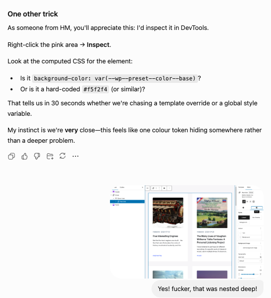
Learning where that colour lived took the best part of an hour.
I’m not convinced that hour was well spent – I have been exposed to inheritance choices that are in default Ollie, but I am not at all certain they are the best way to default a theme’s inheritance logic, and I am even less than certain that the FSE model is good at making these choices visible and easily manageable. Which they should. A bug? No, probably not. A less than ideal ux choice by the WordPress project? Yes. And a less than ideal configuration choice by Ollie? Yeah, that also.
If inheritance is one of the central ideas in Full Site Editing—and it clearly is—then inheritance should be a first-class citizen in the user experience. At the moment it feels more like a hidden undercurrent that needs to be teased out through a process of elimination. For users, especially those new to WordPress (but to be honest in FSE that includes people with decades of WordPress experience) the editor needs to give a far better experience of this concept.
Just in case this section concludes in too negative a tone I should add that the model is excellent, and essential, and makes a lot of sense. However, it does need to be set up in a clear way at the outset of a theme, and it does need to be more easily identified in the admin UX.
An Actual Bug – Pixelated Thumbnails
My ai co pilot is pretty insistent this isn’t a bug, but I’m sticking with it as a bug. In the admin, looking at the editor of the Index page (index ‘template’ if you will) the thumbnails of the posts looked lovely – sharp crisp, gorgeous. On the live site, they were pixely garbage, utterly horrid. Tiny thumbnails stretched to cover huge areas, and looking entirely horrid.
Rather than immediately diving into code, we treated it as a debugging exercise. We started by asking what evidence we already had, and then tried to disprove our assumptions one by one.
First we checked the obvious. Were the original uploaded images simply too small? No. Opening the media library confirmed they were perfectly respectable resolutions.
Perhaps WordPress had generated poor thumbnails? Again, no. There were plenty of appropriately sized images available.
Next we opened Chrome’s Developer Tools and started looking at what the browser was actually receiving. This was probably the first real breakthrough. The browser wasn’t downloading the original image at all. It was downloading a tiny 125-pixel thumbnail and then stretching it to around 500 pixels wide. (As it turned out, that 125-pixel thumbnail wasn’t part of the bug at all—it was stale attachment metadata dating back to the site’s previous theme. More on that in a footnote for the curious.)
That immediately changed the question. The browser wasn’t making a mistake. It was faithfully rendering exactly what WordPress had asked it to render. So we inspected the generated HTML.
The image element wasn’t using the full-size attachment at all. It was rendering as size-post-thumbnail, complete with a sizes attribute telling the browser that the image would only ever occupy around 125 pixels of horizontal space. Given those instructions, the browser was doing precisely the right thing.
The obvious conclusion was that somewhere inside the theme we had accidentally configured the Featured Image block to use thumbnails rather than full-size images.
Except… we hadn’t. Back in the editor the block inspector still insisted the image resolution was Full Size and that contradiction became the centre of the investigation. At this point we went back into Full Site Editing and started tracing the block hierarchy again. Query Loop. Post Template. Blog Post Card. Post Content. Featured Image. Every setting we could find appeared to agree with the editor. Nothing suggested thumbnails should be used.
That was the moment we stopped trusting the interface.
Instead of inspecting blocks visually, we switched the Index template into Code Editor. Not PHP, not theme files – the actual block markup WordPress had stored for that template.
There it was.
The Featured Image block contained the expected settings for alignment, height and styling, but the one attribute that actually determines image size simply wasn’t present.
The editor was displaying “Full Size”, but the saved block never actually said so.
We manually added:
"sizeSlug": "full"saved the template, refreshed the homepage, and the problem disappeared immediately.
The generated HTML now rendered size-full, the browser downloaded the correct image from the srcset, and the homepage finally matched what the editor had been showing all along.
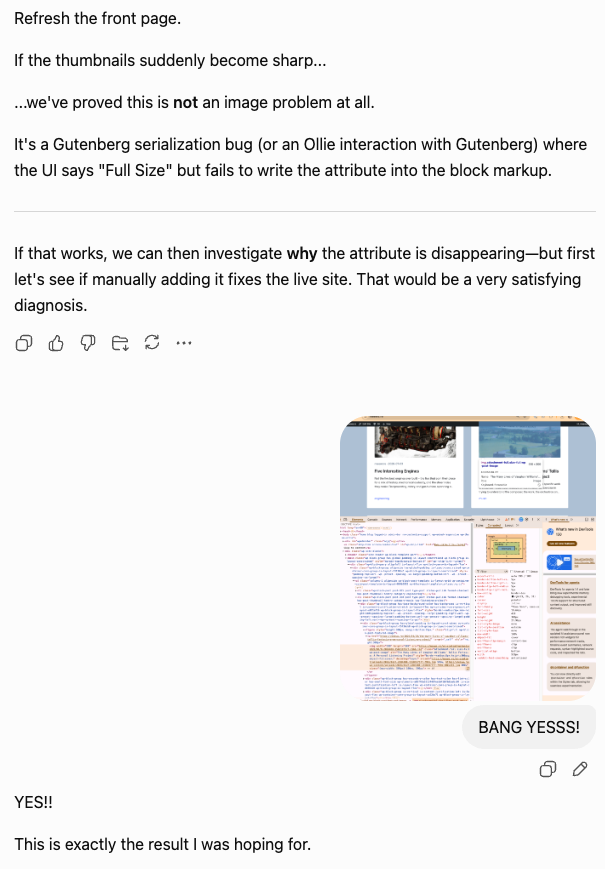
At that point I wanted an independent opinion rather than congratulating ourselves too quickly, so I took the evidence to Claude. The first discussion with Claude had happened much earlier in the investigation, simply as a sanity check on our reasoning. This second conversation was much narrower: we’d fixed the problem on my site, but had we actually discovered anything generally useful?
The answer appears to be yes.
Claude traced the behaviour back through Gutenberg’s implementation of the Post Featured Image block. The current thinking is that when the sizeSlug attribute is absent, the editor presents “Full Size” as the apparent selection while the renderer quietly falls back to post-thumbnail. Whether that omission originates in Gutenberg, in the way Ollie’s template was originally authored, or somewhere in the interaction between the two is still open to debate.
I’m perfectly happy to leave that debate to the maintainers.
From a user’s perspective, if the editor tells me I’m looking at one thing while the published website does something else, I’m comfortable calling that a bug.
I’ve actually dropped a comment on the gutenberg project issue for this and hopefully that will be a useful contribution. FSE is a great way to think about a website, but at the moment it’s not quite got the maturity and ‘good habits’ that a great CMS model needs. That will come, and I’m glad I’ve started to explore it properly.
Now it’s time to crack on with the new theme, evolving the style, and also using the desktop mode plugin (more on that too another time) and enjoying a properly modern WordPress world.
Footnote: The mysterious 125-pixel thumbnails turned out not to be part of the bug at all, but a relic of the site’s previous theme. The specific images still carried 125×125 post-thumbnail metadata generated years ago under Simply Read, and WordPress quite reasonably continued to use that until the thumbnails were regenerated. It was a good reminder that a successful fix doesn’t necessarily mean you’ve completely understood the system—and that it’s worth separating genuine bugs from the historical baggage every long-lived website accumulates.